Strategic clarity.
Refined brand expression.
02The Challenge
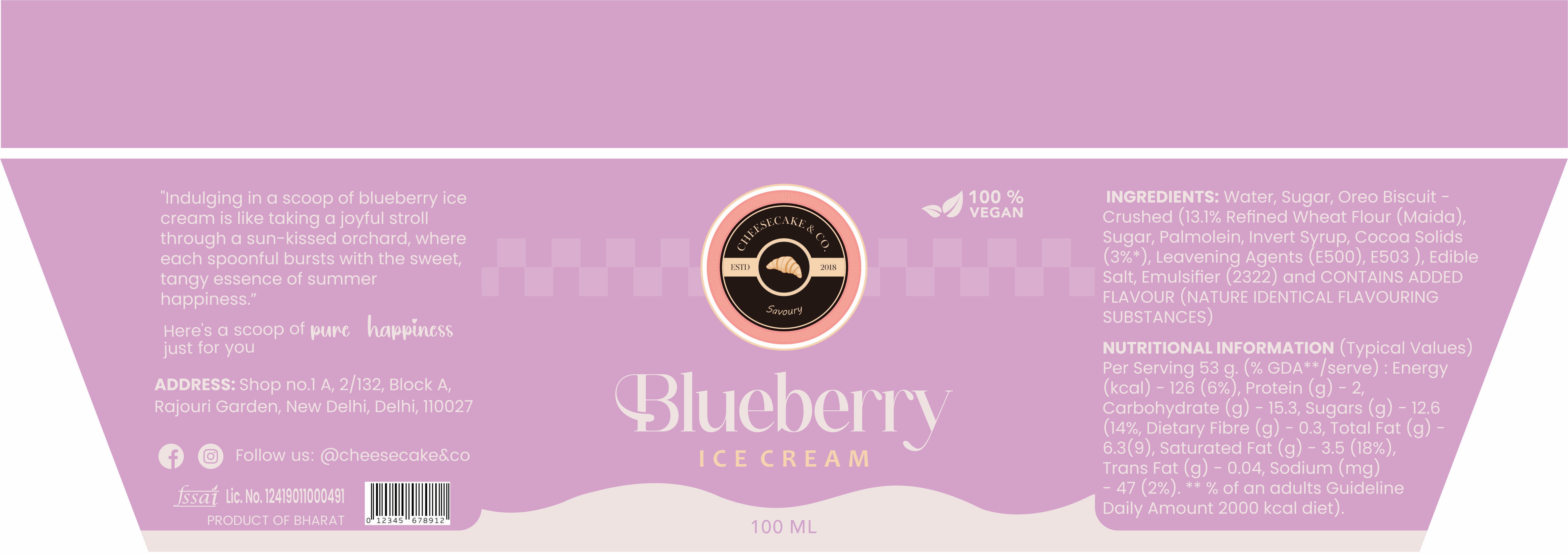
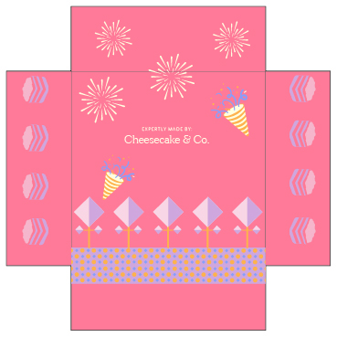
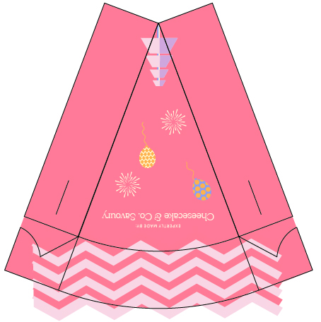
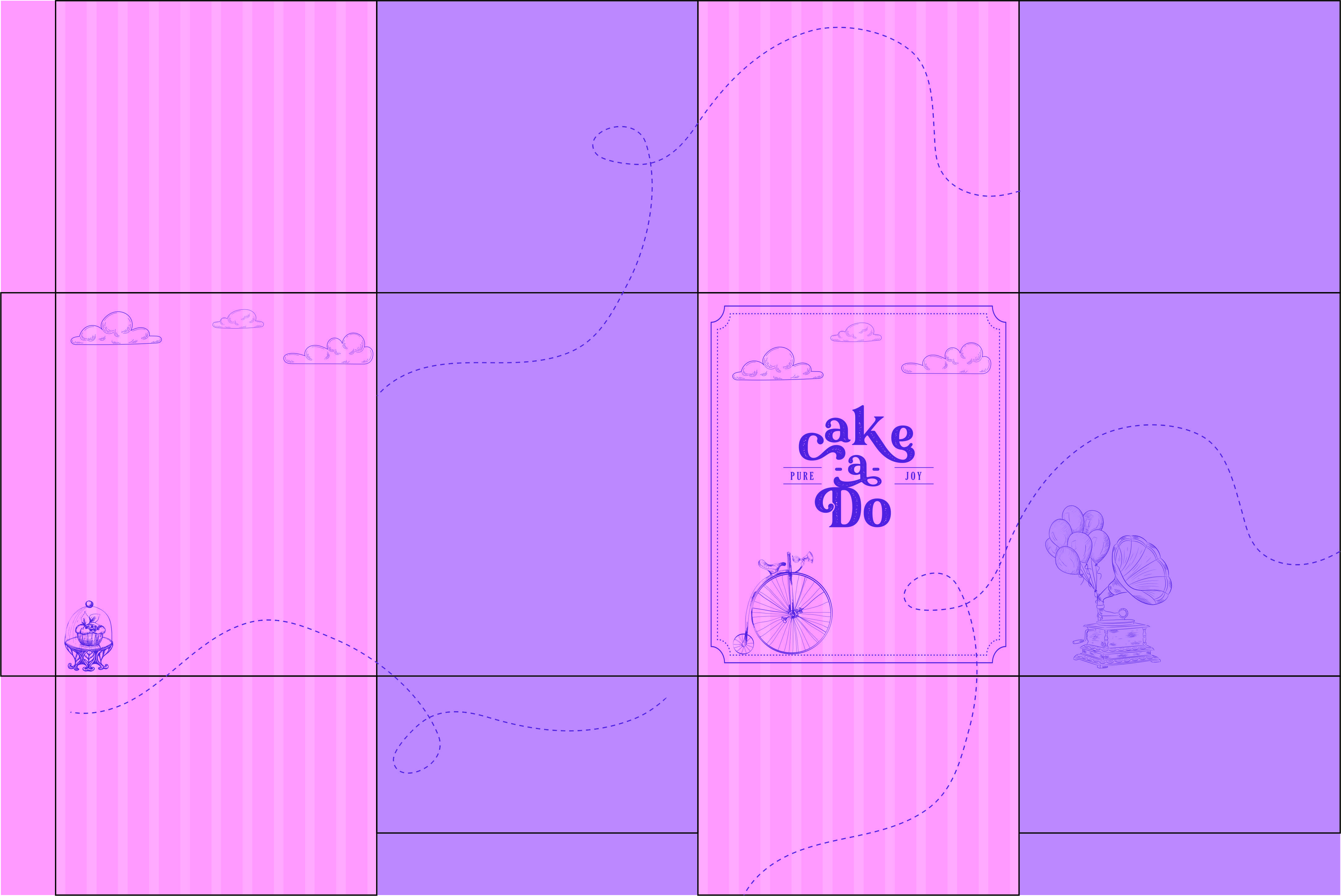
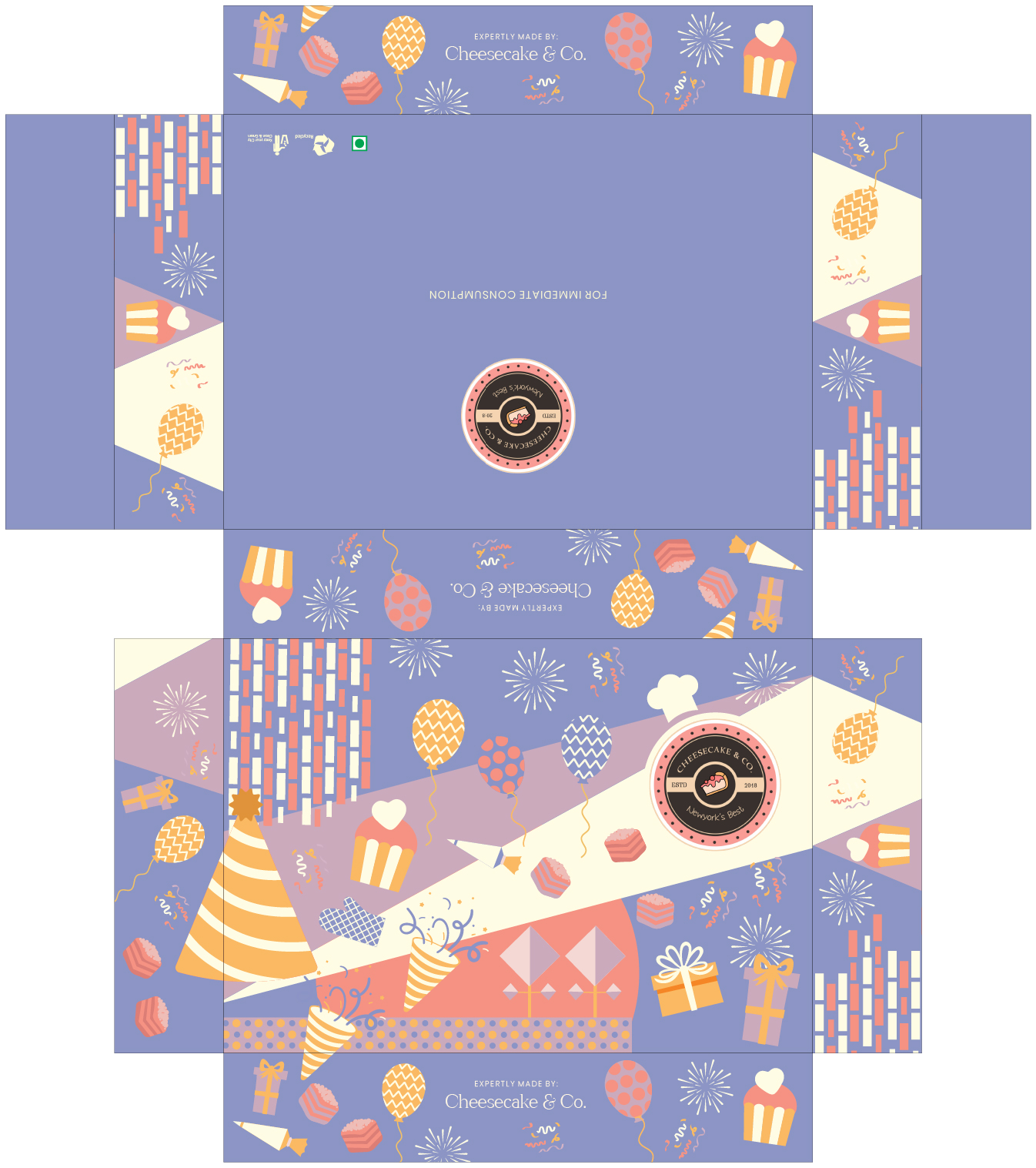
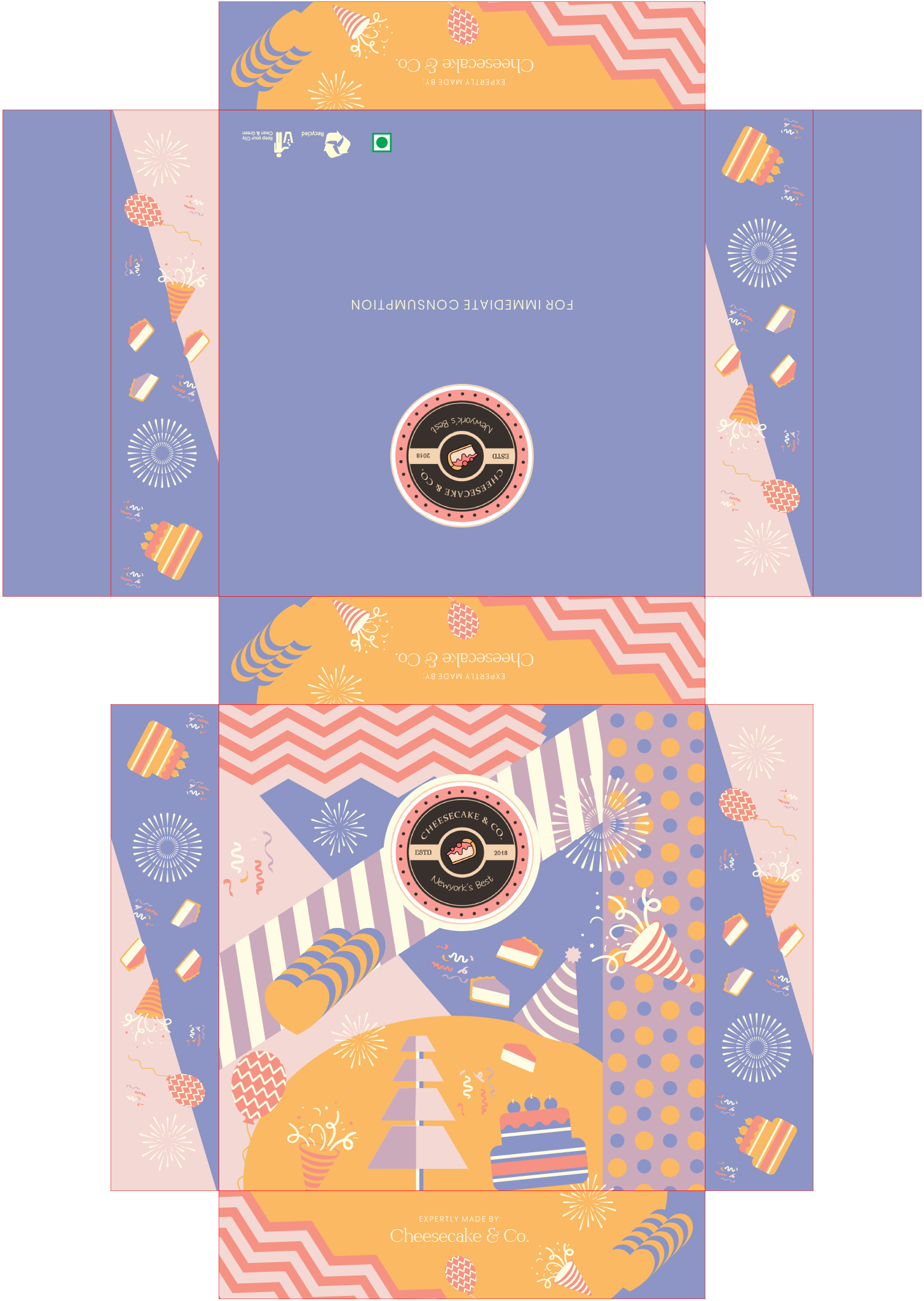
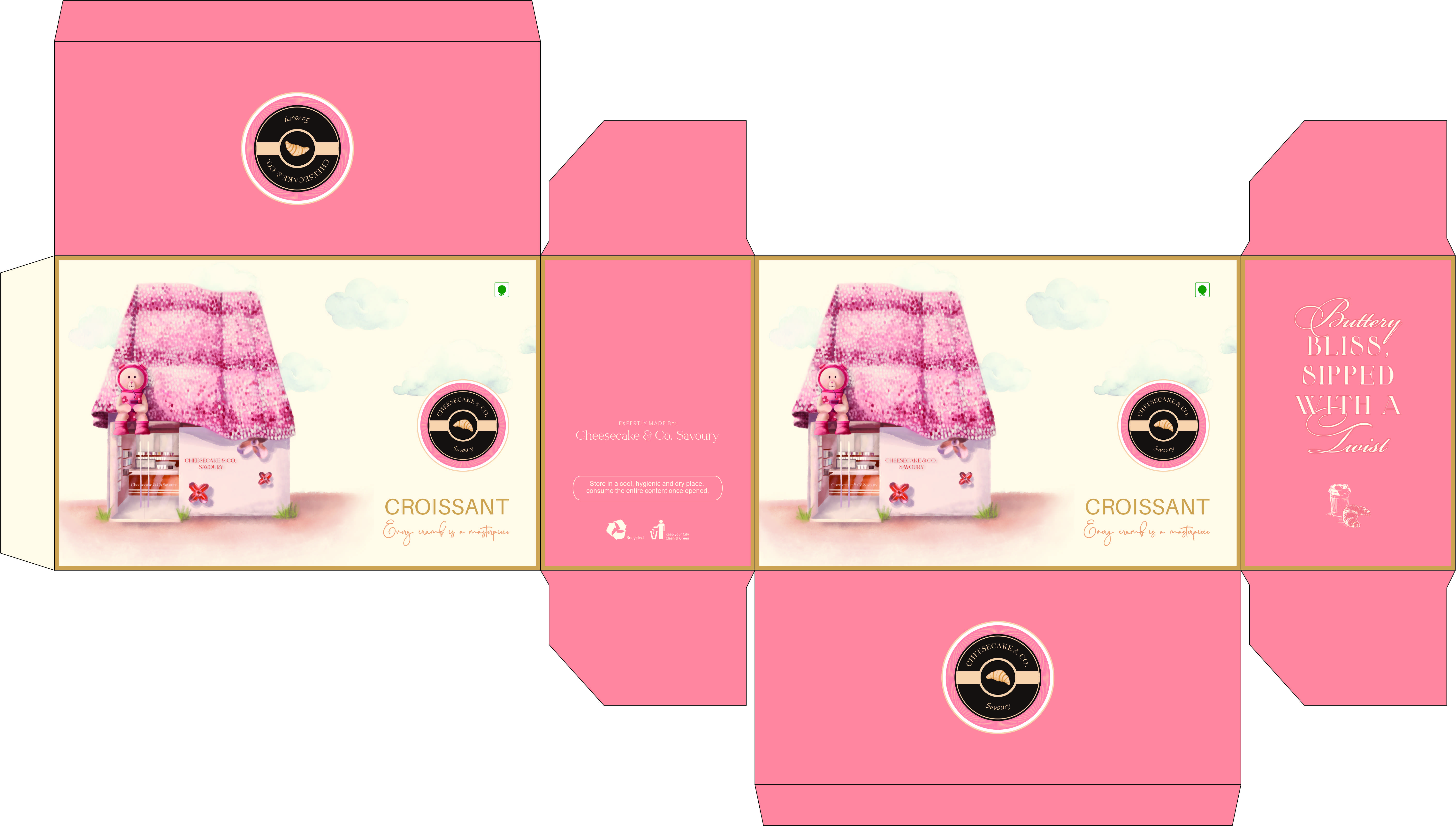
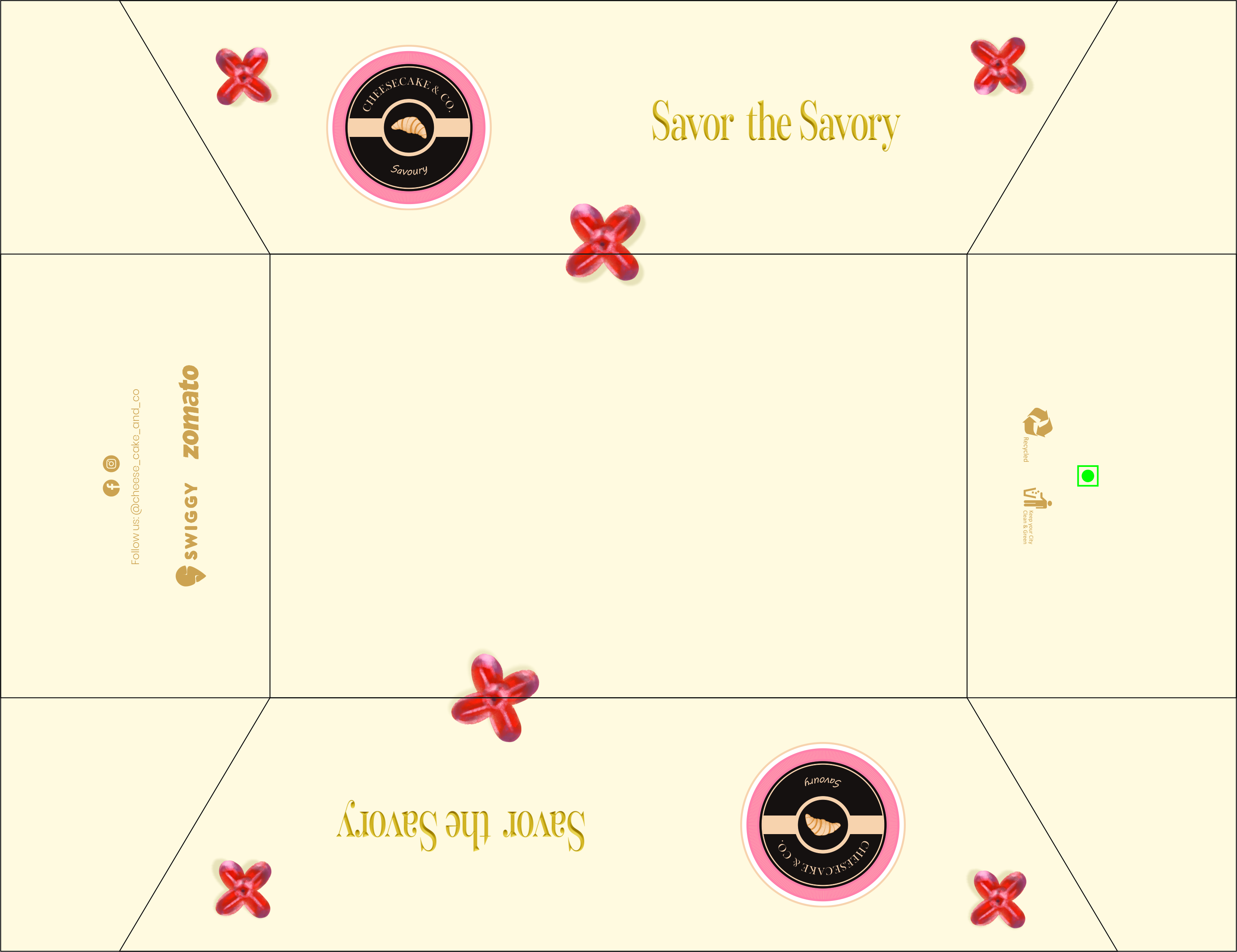
The identity needed to flex across very different pack structures and product lines while keeping each dieline practical, legible and unmistakably part of one family.
Our expertise
From creative concept and brand strategy to precision typography and tactile production craft, our multidisciplinary team ensures every touchpoint reinforces the brand's distinct market presence.
From concept
to seamless execution.
03Execution
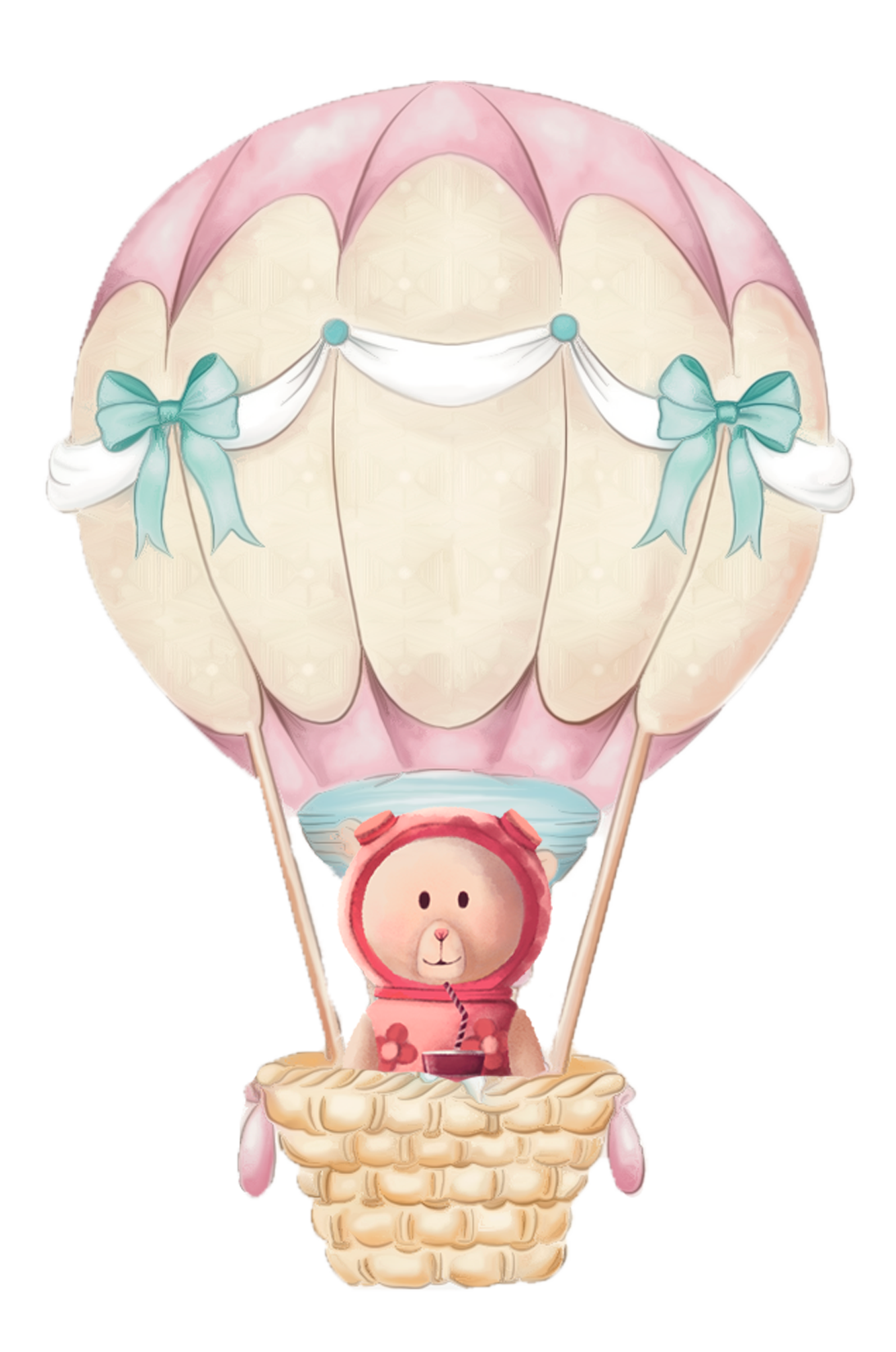
A shared emblem, expressive illustration and a tightly controlled pastel palette connect compact favour boxes, large delivery cartons, creamery sleeves and wide-format packs without forcing every application into the same composition.